
Oneline Info Product
WEBSITE & INFO PRODUCT
Website created to share an info product on how to boost productivity in home office during the pandemic.
ROLE
Growth, Research, A/B Testing, UI
DATE
2020
TOOLS
photoshop, figma, miro
DESIGN CHALLENGE
Create an info product business, a website for people to access it, and social media content to share the campaign. The project aimed professionals working home office and how to boost productivity.
DELIVERABLES
hi-fi prototype, website
UX DESIGN / UI DESIGN / VISUAL DESIGN
context & topic
The project started with the definition of the main topic, we wanted to offer a product that would help people who are struggling to adapt to home office. We chose to bring relevant content that our users could quickly put into practice in their lives.
Our info product was an e-book with a list of 9 apps that would boost productivity in home office environment, Our goal was to create the product, develop a website to host it and get a certain amount of leads.
summary
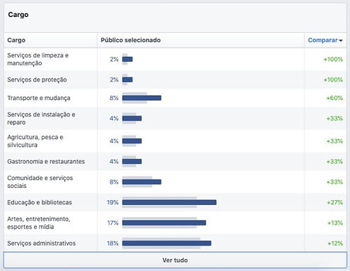
The project briefing required us to target the same audience as WeChat, so the research process started by using main key-words to collect data from our potential users.
Data showed us our users careers so far, relationship status, education level and other liked pages on facebook.
_edited.jpg)
_edited.jpg)
_edited.jpg)
-
User are predominantly male
-
25-34 years
-
Have university education
-
Mostly single
-
Working with administrative and operational areas, education and libraries, entertainment, artes, media and transportation
-
Main interests in business, media and culture
research & data
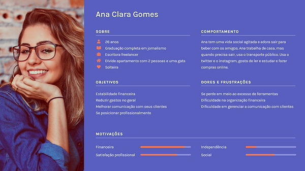
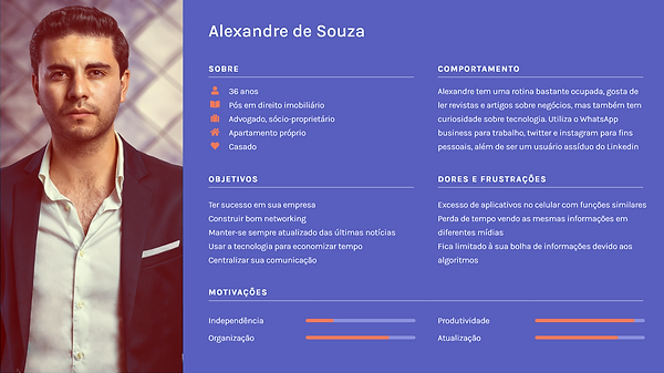
Personas
Based on the data collected along we identified and built 2 personas in order to better understand our users and their needs.
Ana Clara is young freelance writer. She likes spending time with friends, reading, and studying. She wants to better organize her finances and manage her professional contacts.
Alexandre is a busy lawfirm owner that likes keeping himself updated with latests business and general news. He uses multiple platforms for work, news and social purposes, so he would like to centralize his communication in order to be more productive
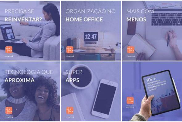
Branding
Based on our users' personas and data collected, we created Oneline brand design and visuals that would compose our digital product. The brand included logo, colors, typography and social media templates.
Logo
Colors
#595FBE
#F47958
#e61b72
Typography
Lato
Aa 123
H1 - 48 px
H2 - 32 px
H3 - 24 px
Paragraph - 18px
Social Media
final design

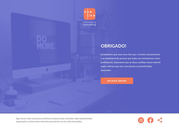
thank you page
2nd version for A/B testing
We ran an A/B test to find out which layout would perform better, as the number of leads was an important metric. The second layout was just one fold with a quiz and the form.
Although the quiz was engaging, the results showed us that our users were more comfortable giving away their information when the page had more content and didn't jump straight to the data collecting.
.png)
user flow
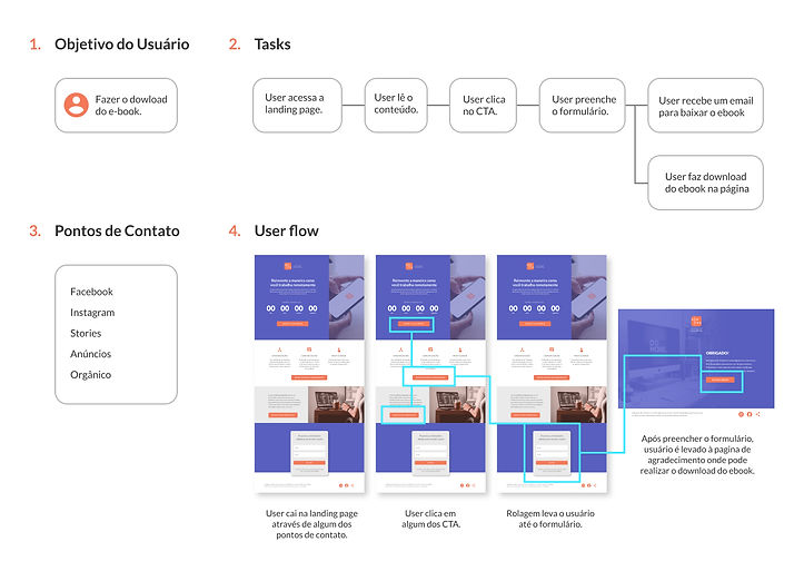
A user flow was created to illustrate all the points of contact that our user could access our page, the tasks and the CTA buttons available to download the e-book.
user testing
We've created a test plan for users to complete tasks and validate our options of layout, complementing our A/B testing digitally performed.
goal
Find problems in the user flow and verify which layout option is more engaging for the user.
summary of findings
-
Users expected immediate download of the e-book, instead of a button on the thank you page.
-
The content of the second and third fold from the first layout were not seen by some users.
-
Users were uncomfortable giving away their information before accessing the quiz on the second layout option.
takeaways
Participate on this project from start to finish was a really positive learning experience. I interacted with a great set of professionals and we all contributed to build this product and having a multi-disciplinary team enriched the whole process and the result.
It was great to see the usability test coming up with such interesting results even if the page was not complex. The feedback allowed us to iteract and improve our product to get even better results for the assignment.